Pages

Sunday, November 29, 2009

Flowers for my Favourite Aunt


I made this card for an Aunt of mine who has her 82nd birthday next month.  She is a real live-wire and also loves her garden, so this card 'fits' her perfectly.

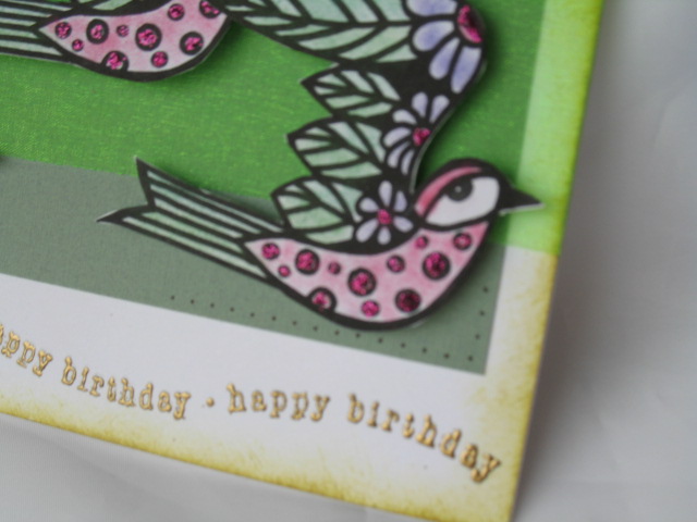
I put the dp through the cuttlebug using the D'Vine swirls, and it broke the surface of the colour, so to hide that, I covered the swirls with Kindy Glitz, love the result!!  I sponged the edges with versacolor  Raspberry ink.

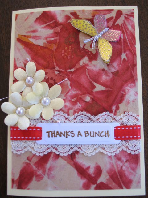
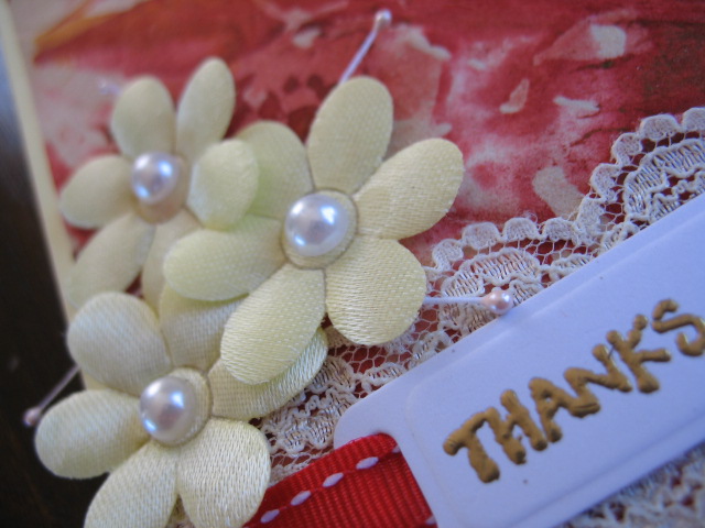
The flowers are a set of three - same flower but different sizes from kiwistamping, and I painted them with twinkling H2Os, using hints from Lovely Linda's tutorial about colouring.

The leaves I cut from green paper, crimped them, and then touched them on an Adirondack Bottle Green inkpad.  Not obvious, but it adds amazing dimension!!


As can be seen, I mounted the flowers at different levels - the largest on a full sized dimensional, then I cut one in half to mount the medium sized ones (very fiddly, be warned) and the smallest flowers were simply mounted with double sided tape.

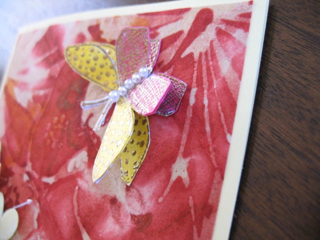
The butterfly is one from Hero Arts which I love using. Again it was painted with Twinkling H2O's.  I decided that there was enough sparkle and dimension not to add any pearls or anything more!!

Thanks for calling by - I love to know that you have called and really appreciate any comments.

Have a blessed day!!

Vicki has candy!!

Click here to see Vicki's Candy - it closes on 30th November so be in quick. 

Friday, November 27, 2009

Butterfly and Flower Thanks

I made this card for a specific person and now realise that it also 'qualifies' for the SSCC#14 - giving thanks!!  I do love it when things work out like this.


The dp is a floral design that my Daughter-in-love gave to me, and this is the first time I have used it.

The lace is a couple of strips put back to back - some from my late MIL's stash!  The sentiment is from Kiwistamping (a great one for flower thank you cards). I used a nestie label die to cut out the label and then threaded some red stitched ribbon through to cover the gap between the two pieces of lace.

The flowers were some from a bargin shop, with Kaiser half pearls in the centre, and some stamens that came in a mystery parcel from England earlier in the year.

The butterfly is by Hero Arts, embossed and then painted with twinkling H2O's. There are actually three butterflies folded and layered together which gives wonderful dimension, and does not squash flat when posted - always a bonus.  I finished it off with three very small pearls and one small half pearl on the body.

I do love it when you call by and leave a comment - it is a real blessing to know you have been. 

Have a blessed day.


Wednesday, November 25, 2009

Banner - HHN23


I made this yesterday afternoon - I am running a week or so behind with these challenges - a series from Splitcoast Stampers on the Names and Attributes of God. 

I used some designer paper that I have had on hand for some time for the background.  I was tempted to add some texture to it, but decided that there was enough depth to it not to warrent that!

The title and sub-title are computer generated, and once I placed them on the page they looked very stark, so out came the Whisper Mossy stone inkpad and the sponge to soften the edges, which continued throughout the page!

The ribbon is one that I have used on every page on this challenge to give some visual continuity.  The three dots are a gold dimensional glue to represent the trinity.

I have chosen to hand write the scriptures from very early in the challenge, in the hopes that one day my family will cherish this project and the personal touch of my writing as much as I have enjoyed doing it.  Is that being vain??  Hope not!

Thanks for calling by, and I do treasure your comments.

Tuesday, November 24, 2009

Watercolour Tree


I was asked to make a masculine birthday card, for someone I had no information about what they liked etc... a bit daunting, but out came the good old standby, the Stampin' Up set Lovely as a Tree.  Because I initially selected a dark green background, and intended to stamp on a pale green shimmer paper, I chose to work with watercolour crayons on the stamp.  The result was not quite what I envisioned as I set up the stamp, but I was still pleased with the result.  I stamped the greeting with bottle green on the same paper, then mounted both images onto a brown card of which I only had scraps.  I was working to the sketch challenge on crazy4challenges so decided to grunge up the scrap of swiss dotted card I had on hand with espresso ink for the background piece.  So far so good. 
Then came the change from green to red background, and I was still dissatisfied as the card looked bare. Photo corners was the next thought, but as I have none and did not want to experiment making them, I then went to the cuttlebug vintage corners, and ended up using what I call a looped edged square, but I placed it so just the edge was showing.  After assembling all this I was still not content, so the corners got pierced - ah , that's got it.  project completed.  Just hope my customer likes it too!!

Thanks for calling by - I do enjoy your comments.


Sunday, November 22, 2009

Scripture Christmas Card

This card is literally a scripture card - the distressed paper is part of a page of the Gospel of Luke.  I found a second hand new testament in a local thrift shop and decided that I could use it for more than reading.....

The stamp is one of my original christmas stamps from Kiwistamping, a local firm.

The rectangle was cut, embossed and stencilled with a nestie rectangle - I used Whisper Ink - Mossy Stone.  I then crushed and generally distressed the scripture page and used some Tim Holtz distress Tea ink...When I attached it , I deliberately left it looking scrunched and dimensional.

The image was stamped in memento black ink and painted with Twinkling H2O's before being mounted on a slightly larger circle of gold paper.  I used dimensionals to lift the image.

The background paper was from a pack I bought at the Warehouse (equivelent to Micheals), and I sprayed that and the base card with LuminArte Shimmering Mist paints.  I was not worried about the slight blotching as that gave the impression of stars, always essential on a Christmas card :-).

I loved creating this card, and I hope you enjoy it too.  Thanks for leaving a comment to let me know you have visited - I am blessed by your calling in.

Tuesday, November 17, 2009

Layers of Color bird

I so enjoyed the Friends of Faith blog hop over this past weekend, and also the free digi stamps that Layers of Color gave away.  I love the bird and used it straight away!!

I chalked the birds to colour them,  glitzed them up with some stickles on the dots and flower centres, then popped them up over a lime green organza ribbon - note to self, remember that this ribbon melts when heated as when trying to dry stickles in a hurry!!


The gray/green card is a scrap I had stored, and once I had things together, I decided that it needed some more detail, so I did some 'faux piercing' by making dots through the piercing template I have, in the top left and bottom right corners of the grey/green layer.

The sponging on the edge was sponged with a Memento olive ink.


The greeting was stamped and embossed with gold ep


This second photograph gives a close-up showing the dimnension and glitz and the 'faux piercing'.

Thank you for calling by and for your encouraging comments.

Have a great day.

Friday, November 13, 2009

SNR A Faith Perspective Blog Hop

Welcome to Scrapbook News and Review Magazine's A Faith Perspective Thankful for Friends Faith Blog Hop. Today, we're out in force on the internet -- showing our faith and giving the glory to God. United, we stand as Christian paper crafters and blog owners to make a presence on the internet for all to see. We're celebrating the theme of friends and we're happy to share our projects with you based on the verse:


"Two are better than one, because they have a good return for their work: If one falls down, his friend can help him up. " Ecc4:9-10a


If you're just joining in on the fun, you can find the start of the train here: SNR A Faith Perspective - if you are enroute, you should have arrived from Chelsea Cook's blog

First, we would like to take a moment to thank our generous co-sponsors: Layers Of Color, Gina K Designs Stamps and Sweet and Sassy Stamps. Together with Scrapbook News and Review Magazine, these companies have donated some wonderful prizes for today's blog hop.

Prizes? Oh, yeah! There will be three lucky grand prize winners for today's event.


To enter, simply hop to the blogs of all of the participating staff members of Scrapbook News and Review Magazine, take note of the staff member's name, and leave a comment on their posts. Then send us an email at this address
 listing each of the staff members who participated in today's hop. It's that easy. All entries must be received by Monday, November 16, 2009 at 12 noon, EST and three winners will be randomly chosen to win.


What are the prizes?


One $100 gift certificate from Layers of Color Stamps AND a 6 month subscription to Scrapbook News and Review Magazine.


One basket of goodies -- four stamp sets from Gina K Designs and a 6 month subscription to Scrapbook News and Review Magazine.


One set of digital stamps from Sweet 'n Sassy Stamps and a 3 month subscription to Scrapbook News and Review Magazine.


In addition, every participating staff member of Scrapbook News and Review Magazine will offer a free one-month subscription to the magazine to one of their lucky visitors by simply leaving a comment on their blog. That's a lot of chances to win, so let's get to the Hop!


I wanted to share a birthday card I made for a friend who sometimes finds life difficult, so I wanted to encourage her in her faith.

I based the layout on a Splitcoast Stampers challenge.  The stamps used were A Scripture from Our Daily Bread Designs and an SU Stem sayings.  The papers were some from an unnamed pack.  I stamped the main image in Brilliance Pearescent Thyme and sponged the edge of the lemon card base in Memento Bamboo Leaves. 

Three half pearls either side of the reference complete what has basically been a simple card.

The next stop on this blog hop is: Rita Barakat.

Thanks for calling by, and I pray this has blessed you.  I would love it if you have time to leave a comment!! :-)


Friday, November 6, 2009

Another page done!

And I am 'caught up' on the challenge - just in time for the new post on Monday next.

This went together quite quickly after a few hiccups with the printer - basically the coloured ink has run out and what I had hoped would be gold printed purple!!  worth the try - I think.

This meant that I stamped the word peace using my Plain Jane alphabet and embossed it with gold - then cut that out with an oval Nestability, and mounted it on a layer of gold paper (that started life as a chocolate wrapper) also cut with an oval scalloped Nestability. 

The root word for Peace in Hebrew is shalam, which has developed into Shalom, thus I used that for my etiology.  The Scripture is from Romans 1:5 which so accurately spells out where we find our peace (that passes all understanding)

Thank  you for calling by - please leave me a comment and let me know you have visited.

Thursday, November 5, 2009

Challenge - His Hoy Name - Sanctifier

This is part of a challenge I have been doing all this year over on Split Coast Stampers called His Holy Name, where we study the names and attributes of God and then create (a scrapbook page) to illustrate it.


I seemed to put this page off for ages before I settled down to work on it.

The more I studied the more I realised that it is God who does the work - our role is to be obedient to Him so He can be seen through us.

The three ribbons represent the Trinity - God the Father who desires us to be sancitifed, God the Son, Jesus, (also known as the Word in scripture) who is our example and the Holy Spirit who prompts us as to what is required of us.

I used an embossing pen to write the title, and a gold pen to write the verse and the sub-title.  My study notes and other verses are tucked into the back of the page holder that I keep and display the page in.

Thank you for visiting, and may this page be an encouragement to you.

Wednesday, November 4, 2009

Not Blue - not purple, lavender!!

Today I am showcasing a card that 'qualifies' for a three challenges - SCS Sketch Challenge 252 and Ways to Use It 242 as well as Stamping Sisters in Christ Challenge #11 (SSCC#11)

The base of this card sat for days before I finally got it all together with a few changes - subsequently I have some different pale violet ribbon and a bow sitting on my desk in my oddments container :-)


I don't know the origins of the dp, but it fitted really well with the burgundy base card.

I was thinking of a couple in our church when I stamped the image, as they are currently in a difficult season.  I used the Pearlescent Lavender ink, and then realised that it did not 'go' with the original ribbon I had cut for the card.  After a fossick in my draw, presto, here is the right colour, but wrong width, so the ribbon was folded in three - it gave a better colour that way too.

After stamping the image, I then used the same ink to sponge the edges of the panel.  Still a bit bare, and in my oddments container I found these flowers that I had already inked with the lavender ink for another project that changed mid-stream, but were perfect for this one.  I added the pearl in the centre of each one and volia, a completed card!!  DH really likes this one!

thanks for visiting, and may your day be blessed.

Monday, November 2, 2009

Four decades to celebrate :-)


I was asked the other day to make a birthday card for a fortieth birthday.  As I do not know the person concerned,  I asked the person who requested the card what colours the recipient liked.  The outcome was that I had to work with colours that I do not normally put together - burgundy, with cream and green accents............... hmmmmm.  Not my usual spectrum.  I am not happy with the photo quality, but this is the best I can do - especially as the card is now with the customer!!


I started with a pale lime green/yellow base, and used an SCS sketch for the layout.  The card behind the dp is a burgundy, and the dp is in shades of green, mushroom and cream. 

The feature panel was stamped with an SU stamp, finest flourishes, using watercolour crayons spritzed and then stamped. I then sponged the edge with a yellow ink to soften the look of it. The pearls were added and things still did not look finished... I then spotted the irridescent white flowers (a RAK from my friend Linda)  on my desk and presto, the finish was there!  I put a wee touch of dimensional gold glue in the centre of each flower just to finish it.

The greeting was stamped and embossed with gold ep, the 40 was a rub-on, and both panels were rubbed along an embossing pad and embossed with gold ep.  I finished the card with a gold ribbon across the bottom - unfortunately it does not show well in the picture :-(.  

The customer was very happy with the finished article, which is really all that matters.

Thank you for visiting - please leave a comment - I love knowing that you have been.

Something to show...


I finally have completed some cards - I am only posting one at this point.  This fits the SCS Sketch Challenge 249.

It took several attempts before this was finalised.  The colours have not photographed all that well, but it does give a reasonable idea of what they are like.

The image was one I received in a RAK from Linda (Lovely Linda on SCS), and I painted her with watercolour crayons, heat set them, and then a layer of oyster Twinkling H2O paint to give it a sheen.  Then for some sparkle I added clear Kindy Glitz on both her shirt and skirt - after all, a girl must have her bling.

I sponged around the edge of the image panel with yellow ink, then mounted it on a bright blue.  The yellow panel was CB'd using the d'vine swirls folder, and then sponged with a slightly darker yellow ink to give even more dimension. The fence was another part of the RAK, in a lovely glimmer gold paper.  The ribbon and brads were added and the card still looked too 'heavy' for a dancing girl, so out came the angelina fibres, and yellow panel was heated to lift it and the blue fibres added... yes, not all my cards are constructed smoothly!! 

The the gold fibres were added before I adhered the dancing girl!  The sentiment was gold embossed in the bottom corner using gold ep.


I have tried to show the sheen of the H2O's and the glitter in this picture, as well as the glimmer the angelina fibres give - they move with the slightest breath and give a lovely finish.

Thanks for visiting, and I do appreciate your comments, and knowing you have been by. :-)