Pages

Saturday, August 27, 2011

Spring Flowers

Welcome - and thank you for calling

I decided to use this daffodil tag again on this card - I think the fact that spring is showing her face here at the moment must be influencing me! 


The card was quite fast to make - I gold embossed the tag and scripture, and then rubbed Dandelion ink over the scripture to emphasis it, and painted the daffodils with Twinkling H2O's.


I then assembled the card using dp from the Prima Fairy Flowers paper stack, on which I had stamped and gold embossed the sentiment.


The lace layer was from my stash (it came from my late MIL), the  lace threaded through the hole on the tag was in some blog candy from Michelle. The tag was mounted on foam dots for dimension and some amber coloured rhinestones added and the card was done.

I am linking this to:

Thanks for visiting - May your day be blessed

Thursday, August 25, 2011

Ooooops - I'm Late

 "I'm late! I'm late! For a very important date! No time to say hello, goodbye! I'm late! I'm late! I'm late!" 

To quote the white Rabbit in the Alice In Wonderland Film (1951), not that I remember the film, but Wikipedia gave me the quote.

And now to business - McMahon Five Design.com has once again released some stunning images, and this week I have worked with three, so I will get on with the cards and try to make this brief!!

Firstly, and most importantly is the Breast Cancer Freebie - although we focus on breast cancer, we acknowledge that there are lots of other cancers that we need to be aware of.


I wanted to keep it simple so was very reliant on the design paper for this card - it is from a Prima 6x6 pad called Fairy Flowers.  I mounted the dp onto a white base that I had  sponged the edges of with Whispers Sugar Loaf Green ink, then stitched it with a co-ordinating thread. 

I printed the image onto some Cryogen Curious Metalics paper  and painted it with watercolors, and the sparkle showed through beautifully IRL.  I then cut the image out and stitched it in the same thread before adhering it to the dp.
(remind me not to do that again - it was very fiddly)


The heart sticker was trimmed to fit the printed heart on the image, and the buttons were added to complete the card.


The next image is from the Little Ballerina set by Studio 313, and comes with a variety of sentiments.


I started by covering a piece of pink cardstock with pink tissue paper that arrived around the contents of a blog candy parcel (Thanks Michelle).  I scrunched up the tissue and sponged with Whispers Rich Plum ink before gluing it on, and ran the ink over it again once it was dry.  I used the same ink to sponge around the sentiment.


The ballerina was coloured using chalks, and a sparkle pen used to highlight the straps, hem and shoes.


  I cut the bottom edge of the skirt of the costume in inserted some gathered lace to mimic the petticoats.


The flowers were felt ones from the blog candy and layered together with a star brad.  The bottom border was cut using the Floral doily accents from Spellbinders, and decorated with half pearls.

The third card is from McMahon Vintage Digital range and entitled The Welcome.


Once again the chalks came out to colour this gorgeous image - there is an amazing amount of detail in this scene, but I enjoyed the challenge.


Once coloured I mounted the image on some deep pink paper.  The dp is from the Prima Fairy Flowers stack, and this was adhered to a deep green card stock.  


Some Prima lace was used to 'ground' the image, and some Kaiser half pearls in chino in the bottom corners and on the vintage corner, finished the card with a little elegance to match the classy lady in the image.

I am linking this to:

Thanks for calling by - may your day be blessed


Wednesday, August 24, 2011

Something Fishy


Welcome, thank you for calling past today.
I had a brief time in the studio, and I needed a thank you card for a friend and I wanted a 'fishy' theme.


I wanted to use a digital image as my time was limited, and I ended up with these dragonfly images that I won from The Crafty Purple Frog - I was not all that confident using them, but I was happy with the result.


After cutting and layering the images on foam dots, I decided to use a dark blue base card, and then a green over that - I trimmed the bottom of the green with some fancy scissors to mimic waves, and layered it so that the silver embossed sentiment was on the blue.


I still wanted a fish image, and decided to use this stamp from Hastings Rubber Stamps,  and simply stamped it twice with versamark ink, decided that the images were not visible enough, so then sprinkled over some yellow pearl-ex, and brushed it off, and I was satisfied :-).


Why the need for a fish image?  When we moved to our home five years ago, there was one fish in the pond, we thought.  We then discovered that there were five fish with the appearance of four baby ones.  Unfortunately over the last few years three of them have fallen foul of the local feline population, so the remaining two have lived in a watery 'Fort Knox'.

Today my friend let me take a couple of her fish to keep my two company - we have named them Pepper and Salt - Pepper because it is so very red, and Salt as there are white markings on the other.

I am linking this to:

Thanks for visiting, may your day be blessed.


Tuesday, August 23, 2011

I won


Just a quick post to thank  Happileigh Scrappin' for choosing this card to win last weeks challenge - to use cool colours.

I am honoured, and thank you for the generous prize. 

Thanks for popping in - may your day be blessed.

Thursday, August 18, 2011

The Captain and Peas and Thank You

Welcome again - I am so glad to see you here.

This week at McMahon Five Design.com there are quite a few images being released, so once you have finished here, I invite you to visit the other blogs (click on the links on my side bar) to see all the gorgeous-ness!


 This handsome fellow was coloured using chalks, cut out  using an oval Nesties die  by Spellbinders.  The edges were sponged with Memento Summer Sky.  He was then mounted on a blue oval that was sponged with Memento Danube Blue, and lightly sprayed with a silver glimmer mist.


 He embodies the dignity of a Cruise Liner Captain, so he deserved the wonderful dp Ocean Waters from Studio 313, to set him off to perfection.  The paper was printed onto Cryogen Mysterious Metallics paper with the very discrete sparkle that shines through whatever colour is applied over it.


I mounted this simply over some blue cardstock with the addition of a corner embellishment (a Cuttlebug Vintage Corner halved on the diagional),


and a simple stitched ribbon knotted in the centre.

In contrast the next release is by Studio 313 and is titled Peas and Thank You and is a rather fun set.  I have taken two elements of the nine in the set (nine images, how generous is that!) to make this card.


I just loved these wee peas in a pod and could not resist using them.  


I coloured them using dye inks as paint - after painting the image I then cut them using the nestie oval dies and sponged some ink to form a background before removing the die. The green layer was cut using the scalloped oval.


The sentiment was printed, trimmed and the corners rounded, and mounted on  a layer of green card.  When mounting it I used foam dots to give some dimension.

To assemble the card I  took some dp from a scrap pack, embossed it using the hounds-tooth folder, added the long ribbons then layered it onto the green base.


Thank you for visiting with me today.  May your day be blessed.


Tuesday, August 16, 2011

I tagged it!!

A warm welcome to you all - it is so gratifying when my counter tells me you have visited. I do hope you enjoy your visits.

Some months ago I won some stamps on a new release blog hop by Our Daily Bread Designs, and this weekend I inked them up - and this is the result.


The motivation behind inking them up was that The Our Daily Bread Blog Team have a challenge  in which a tag must be used!


I stamped the tag and sentiment in Violet ink and clear embossed them. The flowers were stamped again with black ink on white card and painted with twinkling H2Os, fussy cut, and then adhered over the original - you can just see the sparkle in this shot.

The doily is one from a pack I bought years ago when I first started stamping. Unfortunately they are plate size, not cocktail size, so I had to trim it to fit somewhat more than I would prefer.

The lace is some I have on hand, but after adding that, I still felt the whole was somewhat dull, so out came the rhinestones and volia, I was very happy with the end result.

I am linking this to:

Thank you for visiting - May your day be blessed


Monday, August 15, 2011

Snow and Knitting

Good afternoon to you all.

It has been a most unusual day here - it has snowed, and in the first fall before 7:00a.m. there was enough on the ground for snowballs to be thrown!! (I was not up then, I might add, but my neighbour told me of it).  The next fall lasted just on on hour and started about 8:00a.m.

And although I took the camera outside, I only took video footage!

The cold and snow went as far north as Auckland, and my daughter wrapped herself and her daughter in their "Gran jerseys"


The Aran jersey my daughter is wearing is one that I knitted for her some sixteen years ago - the jersey her daughter is wearing was the one I knitted earlier this year!

This photo was taken this morning just before they headed out to Playcentre.

Thanks for calling by - may your day be blessed.

Friday, August 12, 2011

Green Birthday

Welcome once again - I am back this time with a card inspired by the
Stampin' Sisters In Christ Challenge this week.


The challenge is based on this scripture,
Lam 3:22 –23 “The faithful love of the LORD never ends! His mercies never cease. Great is His faithfulness; His mercies begin afresh each morning.”
And I would encourage you to go over to their site and read through the devotion there.  The challenge itself is to: 
Dig deep into your craft cupboard and use something from your stash that you 'just had to have' cause you would use it everyday....but have forgotten about...

I thought about this for a day or so, and went right back to my beginning days when I did not know about bling or die cuts etc, and I had bought several balls of plastic raffia, and a huge sheet of finely corrugated card from the local stationers... and have hardly used them!! These were my starting points.

I then saw a piece of card on my desk that was a 'trial' in colour blocking using watercolour crayons and spritzing , after it was dry I sprayed it with a silver glimmer mist.  I was not happy with it for the card I planned then, but it 'fitted' this card.


Here you can see some of the sheen it has.

I chose this quote from the Layers of Color Encouragement set and stamped it in bottle ink on the lemon card stock.  After cutting it with a Labels 14 Nestabilites die I sponged it with Memento Dandelion ink.  I also used that ink to sponge the edge of the coloured card.


The raffia was wound around the green corrugated card and secured with a bow, and adorned with a green rhinestone.

The sentiment was stamped and embossed - I love this sentiment as it is elegant but does not 'hog the limelight' on a card like this.

The final details were the rhinestones and the butterflies, flowers and leaves which were part of some paper lace (another acquisition that I just 'had' to have....) that I cut up and adhered randomly around the card.

I am linking this to:

Thanks for calling in - may your day be blessed

Thursday, August 11, 2011

New Mexico Release..

Welcome back for a second release today - with having made my cards early thanks to the break, when this new set, New Mexico  by McMahon Five Design.com was offered, I took the opportunity to use it.


This is the first card I made


The background card was embossed with the Retro Squares folder, and the edges sponged with Memento Bamboo Leaves ink before being mounted on an olive green base.


The sentiment was cut out and embossed with a Nestabilities rectangle , and sponged with the same ink. The scalloped rectangle was sponged with Whisper Orange ink.


The jars were 'fussy cut' and painted with twinkling H2O's and mounted on foam spots.  


The second card I used some dp by Studio 313, called Ocean Water, but turned it ninety degrees to make it look like smoke whisps.


I cut the sentiment out and mounted it on the same card as the base of the card.


The sombrero was fussy cut and coloured with watercolour pens


The peppers were again coloured with the watercolour pens and fussy cut, and then I put a layer of dimensional glue over them, which gave them a wonderful glaze and made them a real feature of the card.

I finished the card with some bright red ribbon and a button.

I am linking this to:
Thanks for calling by - may your day be blessed

Release Day again :-)

A warm welcome to all who call by!! I do appreciate your visits.

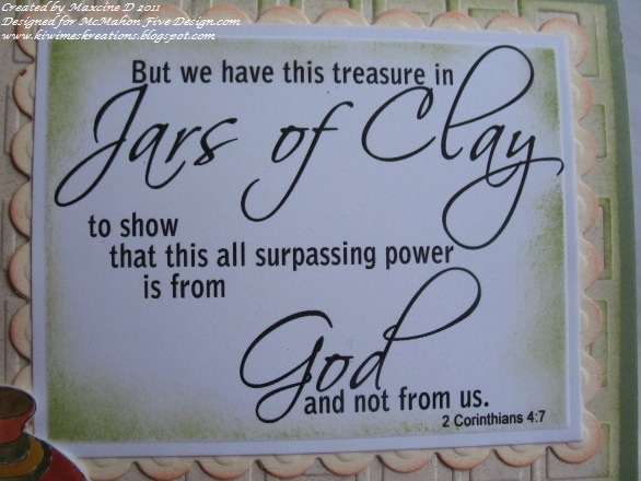
This week at McMahon Five Design  there are six new releases in the digital range of stamps, and I am showcasing two of them.

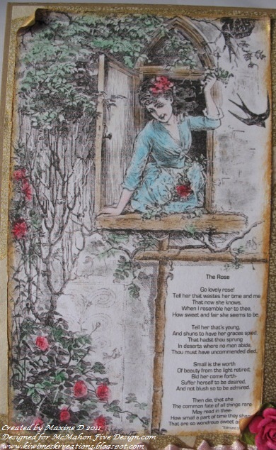
Firstly there it the image named The Rose from the


This is a wonderful image and I enjoyed working with it - I coloured it with chalks, and distressed the edges and sponged them with Tea Stain distress ink.


This was mounted on a thin piece of design paper that had skeletal leaves printed in gold on it, then mounted on kraft cardstock.


For a slightly more aged look, I rolled two of the corners and painted the back with Pearlescent gold ink, and also added a layer of the ink over the distress ink on the edges, which gave a wonderful depth to the distressed edges.


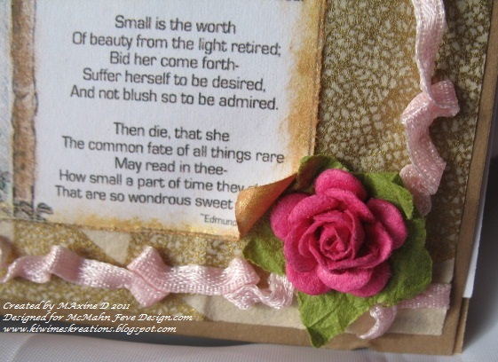
The narrow pink ribbon was gathered by hand and caught under the edges of the d/p, and a wee rose (part of a RAK) was added in the corner.

And for those of you who wish to peruse the poem by Edmund Waller, here is a photo of it.
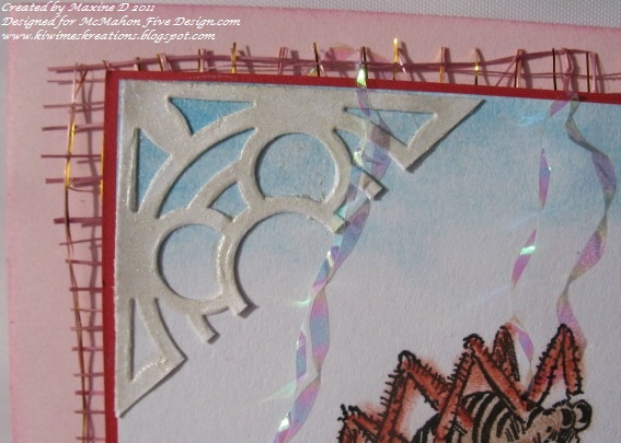

Also from  McMahon Vintage Digital comes the nursery rhyme image
Little Miss Muffet  


I used chalks  and a blender pen to colour Miss Muffet and her (unwelcome) companion.  After colouring them I added the "cobweb" to the image before mounting it on some deep crimson card stock.


This was mounted on pink card stock (sponged with Rouge chalk ink) with a layer of florists mesh between - this has a gold thread in it that gives a lovely sparkle.


I added the half vintage corner after painting it with Oyster Twinkling H2O - the clear 'cobweb' is a Christmas decoration I bought from a local florist/gift shop last year.

The final detail was this braid - 

that was made with a narrow piece of white ric-rak, rubbed over the Rouge chalk ink pad and then wound with the 'cobweb'.

Please visit the other team members (links to their blogs are on my sidebar) to view their wonderful creations and the other releases.

Thanks for calling by - may your day be blessed.

Wednesday, August 10, 2011

Girly Grunge

Welcome again - yes I am on a roll with the card making at the moment.
I saw a card the other day that intrigued me, and the technique was called 
Girly Grunge.
 I am not a great fan of grunge - it seems a bit on the 'dark side' for my taste, so this variation sparked my interest.


I crumpled a piece of paper from an old book I had purpose bought from a charity store, and rubbed my Tea Stain distress ink over it, then tore it to the size I wanted and stained the edges and adhered it.


Some time ago I downloaded this image from Kim's blog (here) where she has a page of steampunk type freebies.  I printed it onto vellum and then clear embossed it.


The butterfly was an interesting one to apply as only the outside was glued together and I had to place the centre rhinestones individually.

The ribbon was 'gathered' onto a strip of glue tape, and the Happy
Birthday sentiment by Hero Arts was embossed in silver onto the torn and sponged violet card. The buttons were adhered with glue dots, and all edges distressed and sponged with violet ink.

I am linking this to:
(Old the Hero Arts stamp is one of my oldest, the steampunk image, frist time I have used that genre)

Thanks for calling in - may your day be blessed